
For three days last October 11-13, 2017, the largest gathering of marketing practitioners came together for the Internet Mobile and Marketing Association of the Philippines’ (IMMAP) second digital congress named DigiCon DX. This year, the congress focused on the culture envisioned to aid marketers in adapting to digitalization as reflected by its theme “DX: The Culture of Digital Transformation”.
So what was I doing here? Well, thanks to friends from the industry, I was invited as part of the media pool — which meant that I could attend sessions as a delegate and get some media access to boot.
This was a change I would not miss. As a blogger usually at the other end of the marketing campaign, I only experienced campaigns from the receiving end. At #DigiCon2017, it was actually a great chance to observe and listen to talks designed from the perspective of brands, advertisers, marketers and PR guys.
Several things marked this second digital congress.
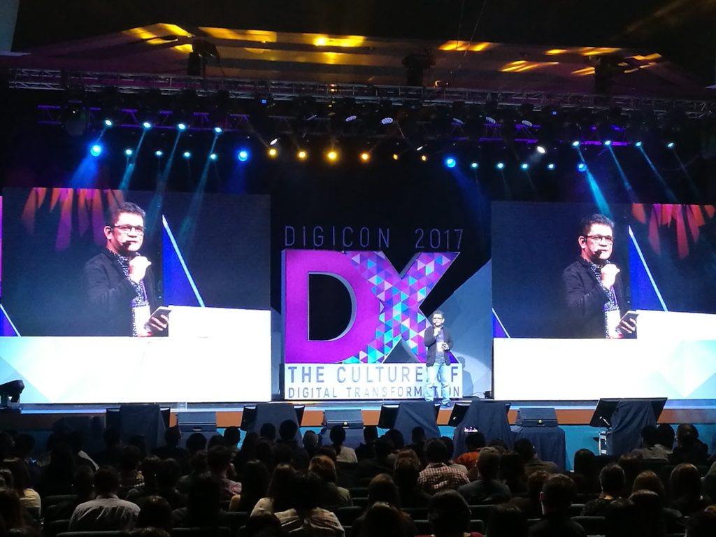
One, the packed plenary hall showed the rapidly increasing number of marketing professionals either already in digital or seriously interested in where digital is going. From what I gathered, around 2,400+ delegates registered.
Two, there were 6 tracks (from the people aspect to storytelling to customer experience) that delegates could choose from representing the pillars of Digital Transformation. There were many simultaneous sessions that I wanted to go to. I was wishing I could clone myself into more Janes just so I could go to each one of them.
Three, the diversity of speakers gave depth and breadth to the sessions. Plenary speakers for each of the 3 days included Brian Solis of Altimeter, Greg Perez of IDEO Tokyo, and DN Prasad of Google. Breakout sessions saw key opinion leaders representing companies such as SAP, J. Walter Thompson, Kalibrr, DDB Group, Microsoft Philippines, WARC, Grab, Uber, Snapchat, Twitter, VISA SEA, Lazada, Shopee, DataSeer, Thinking Machines, the National Privacy Commission, and so many more.
*******
The sessions were really meant for brands and advertisers/marketers but I came away from the digital congress with several takeaways of my own which I found very relevant to being a blogger, social media practitioner, and citizen advocate.
Takeaway 1: Brands must design for the consumer experience
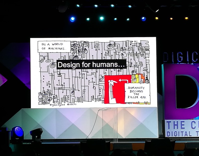
On Day 1, I listened to Brian Solis who spoke about digital transformation. Brian (@briansolis on Twitter) is a Principal Analyst at Altimeter Group, a blogger, award-winning author, and a thought leader in digital transformation. Brian spoke about the need to “learn to unlearn” current mindsets because brands are now defined by the experience their customers have of it. He asked the audience to close their eyes and think of an experience that moved them, mind and heart. He said that is the kind of experience brands need to bring to its customers.
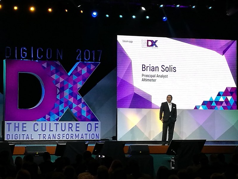
Brian went on to say that a brand may have the best product but if consumers have a horrible experience with it, the brand is in a cluster funnel. So many resources are poured into attracting consumers, hopefully, to a state of loyalty to the brand and yet this is disrupted by their bad experience with it. But when consumers have a great experience, they almost never go back. Businesses, Brian said, need to recognize that “apps that put people at the center of the experience become the standard for every business”. His final takeaway slide said it all:
Here is Brian Solis tackling more questions from a private interview we had with him after his talk. Click each link below to watch the video at YouTube.
On the proper mindset for innovation
On where companies need to start innovating to focus on customer experience
On how digital transformation affects consumer wants and needs
On fake news and its impact on traditional media
*******
Takeaway 2: Show the Data!!!
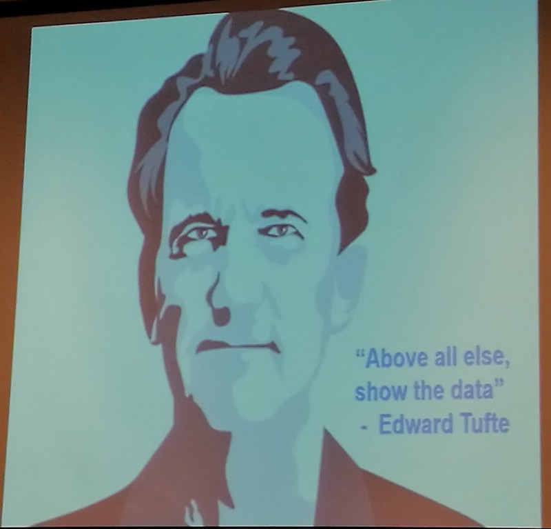
I enjoyed an eyeopening session with Isaac Reyes on the Art of Storytelling. We were able to chat with him before his session opened (the advantage of media being allowed in ahead of delegates in order to set up). When we told him that we were introduced to different applications that allowed one to scrape data and present them in more illustrative forms, he said many times those applications were too complicated for regular people like us who just wanted to show gathered data in visual form.
His mantra comes from Edward Tufte: “Above all else, show the data”. Isaac emphasized that the point of illustrations and graphs is to show data as it really is; sometimes, in an effort to present fancier charts, the data shown can often be disproportionate or misleading.
Between fancy 3D charts and flat charts, Isaac says go with flat charts because they more accurately depict the data. Between pie charts and line charts, he prefers the latter because they more clearly show progression and differences between two or more different factors.
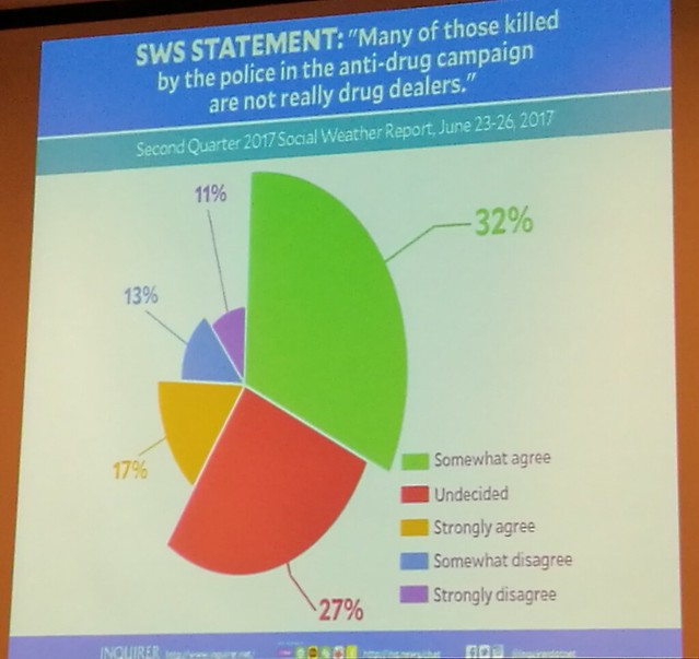
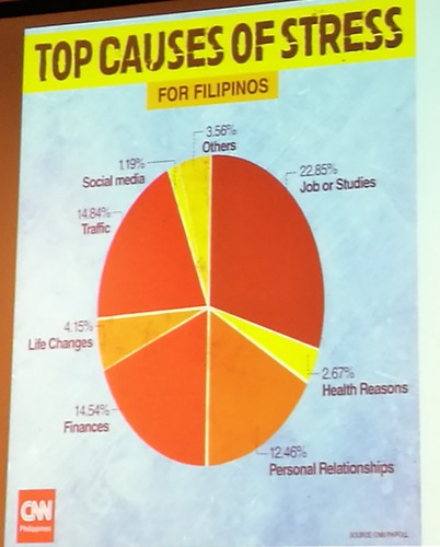
Here are some examples he showed:
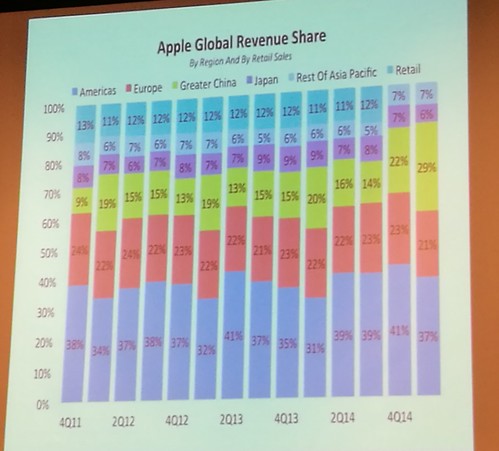
Here is another example of how to present better charts. Let’s say you wanted to highlight Apple’s share in only two markets (US and China), you won’t be able to see it from this chart (see below). You can get a sense of the values in the lowest bars but not the upper bars. And to try to compare the US and China revenue shares is very difficult from here. Also, the differently colored areas are distracting if you only want to zoom in on US and China. This bar graph also does not clearly give your message. It is pretty much left to the reader to make his own conclusion as to what this graph means.
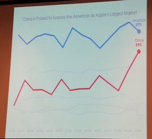
Here’s a better looking chart although it is less fancy. The same data in previous bar graph was transformed into a line chart. All other region data were grayed out to focus only on US and China data. The title is more descriptive of the message versus the previous bar graph title.
I think I will remember Isaac’s talk whenever I decide to place charts on my presentation slides. Simple is better than fancy, especially if the latter compromises accuracy. Here are some tips to remember:
Be wary of 3D charts that may visually slant the data you want to present.
Line charts are often better than bar charts.
Make sure the slices in the pie charts visually represent the actual data percentages.
*******
Takeaway 3: Tell your story disruptively and with purpose, harness emotion,
build connection with your audience.
Edward Pank’s New Age of Storytelling session kept us all glued to the screen as he played different ads that represented disruptive storytelling in different ways.
There was the Art Institute of Chicago that tied up with AirBnB in attempts to attract more museum goers. They transformed a space in the museum into a replica of Van Gogh’s bedroom as depicted in one of Van Gogh’s paintings and rented the room out for $10 a night. They were overwhelmed by reservations.

Another one was an Argentinian organization, MACMA, that wanted to raise awareness on breast examination. They obviously could not show women’s breasts due to censorship issues on many social media platforms so they used a man’s boobs for the ad. The ad ingenuously sidestepped the censorship and became a viral, effective, and educational tool, garnering over 40 million views and over 700,000 shares.
*******
I may not be in the advertising and PR industry but #DigiCon2017’s sessions on digital transformation made me rethink many things I do and write as a blogger to make it more appealing to my audience. One thing is for sure. If I can master the art of storytelling, I think I will be an even more effective blogger and citizen advocate.
Good sharing, thanks! Sad, I missed it though…